Epic
The Epic EMR interface efficiently manages patient data and workflows, simplifying care coordination and documentation in healthcare settings.
Role
UI/UX Designer
Timeline
October 2023 - November 2023
(4 Weeks)
Tools
ChatGPT, Figma, Giphy, Google Workspace
Responsibilities
User Research & Testing, Data Analysis, Information Architecture, Wireframing, Visual Design, Prototyping
What is the product?
Epic EMR (Electronic Medical Record) is a comprehensive software system designed for healthcare organizations to manage patient records, workflows, and medical information electronically.
What is Epic’s support feature?
Epic’s support feature for is an AI "Quick Assistance" chatbot integrated directly within the platform.
This chatbot would provide on-demand support to healthcare professionals navigating the Epic system, offering real-time guidance, troubleshooting assistance, and answers to common queries.
The chatbot could also proactively suggest relevant resources, such as help articles or training materials, based on the user's context within the EMR.
By offering immediate support within the workflow, this feature would enhance user proficiency, reduce frustration, and ultimately optimize the utilization of the Epic EMR system.
The Solution
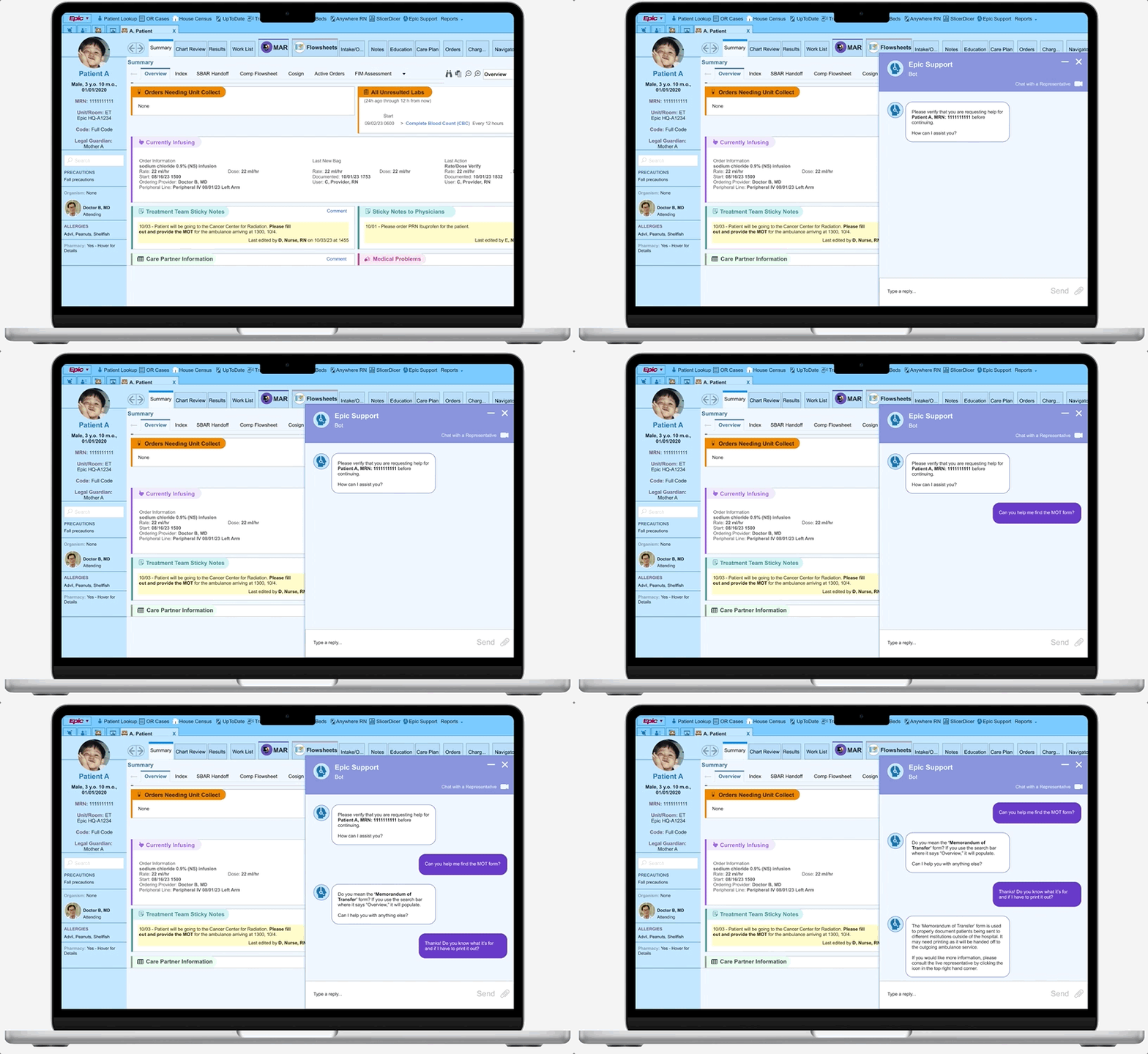
Implement an AI support tool to aid users in navigating Epic's extensive patient data, enabling healthcare workers to optimize workflow and enhance patient care.
Accessible AI Chatbot Feature
Patient Verification at activation promotes HIPAA (Health Insurance Portability and Accountability Act) ethics and prevents patient errors
UI follows suit with conventional chat windows to minimize user learning curves
Ability to minimize or maximize interface to fit user needs
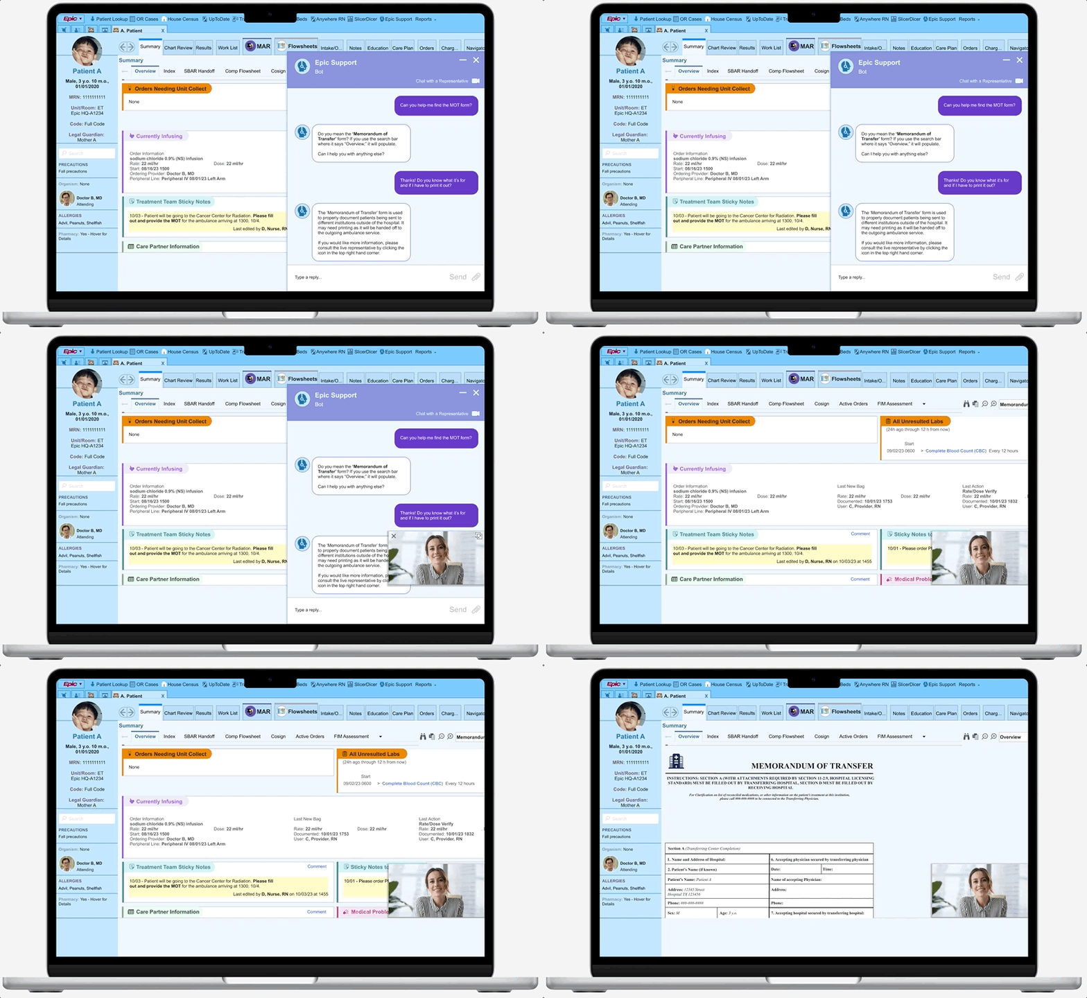
Escalate to a Live Representative
Adds extra user support to give viability to product help options
Able to speak via video and text to fit hospital and HIPAA policies
Research Phase
What steps did I take to arrive at this solution?
Competitive Analysis
Existing EMRs continue to face the challenge of maximizing presented data points and minimizing product learning curves, which occasionally causes user stress and error.
I conducted a competitive analysis to further understand the relationship between various electronic healthcare medical records and user/clinician satisfaction. My research frequently indicated usability issues, and a slow ability to implement product updates due to the amount of resources needed to manage data.
Efficient inter-operability
High initial & maintenance costs
Popular EMR
Epic
Cerner
“Cerner Millennium” synchs third party products
Features have high learning curve
Allscripts
Integration with pharmaceutical products
Slower than competitors in updating features
Meditech
Newly implemented “AI Virtual Assistant”
Common inter-
operability challenges & training needs
User Interviews & Insights
Coming away from the twelve user interviews I conducted, I compiled the gathered data into two major themes: Clarity & Utility.
The First Theme: Clarity
Users will search for clear and concise information to decrease cognitive workload, and streamline their flow.
Male, 31
Clinical Pharmacist
“Epic does a good job showing lab results because it includes resources for reference ranges and is organized by lab classification {making it easier to skim through}.”
Users stress this value heavily, citing it as an overarching rationale when asked how Epic can be directly improved.
The amount of friction induced by task flows (both familiar and unfamiliar) directly affects the quality of satisfaction healthcare professionals have with their jobs.
Female, 30
Medical Resident
“In psychiatry, many of our notes should be censored from patients, but this option has to be done manually by clicking a heart in the upper right-hand corner of the note and selecting a reason for censorship. I wish this would pop up automatically when we create the psychiatry consult/progress note, so that we do not forget to censor it.”
Female, 22
Inpatient Secretary
“It can be quick and easy to find a patient if I use the system lists and the Medical Record Numbers that I’m used to.”
Users often found Epic (or other EMRs) easy to use when completing flows that are common in their daily tasks.
When it came to new task flows, especially with those that did not have clear indicators, they would often look outside of the product for quick solutions (e.g. coworkers, superiors, etc).
The Second Theme: Utility
Users want simple resources and concise responses to help them rectify the issues they encounter.
Users are open to the idea of a new chatbot helping them. However, first impressions are essential here; Users asking for help are often in a state of vulnerability.
Utilizing an available chatbot that is unable to help when used, elicits a visceral, overly negative opinion from the user. The inverse is true as well.
Female, 25
Registered Nurse
“I don’t like it when AI support continues to try to help me at length, even when I know that my inquiry is likely too specific to be resolved with AI (or if it doesn’t give me the option to opt-out).”
Female, 42
Registered Nurse
“I tried to reschedule an appointment for car maintenance and the chatbot couldn’t help me at all…. I had to call to reschedule, so now I try not to use them.”
Male, 34
Physical Therapist
“The chatbot helped me to switch to a subscription with smaller toys {for my dog}. {Now} I look for a chatbot on every single site I use.”
If there were a sliding scale that indicated how willingly users would utilize a chatbot or how much trust they would put into it in the future, the product’s inability to help after users wasted energy would lower its position on said scale.
Still, users will often look outside themselves for help if they can’t quickly figure out a problem.
Female, 40
Nurse Manager
“Oh, maybe Epic should have a function for contacting their Help desk? I’ve never used it, but if it is there. I’d probably use it.”
Male, 47
Attending Doctor
“I would usually call someone, like pathology or imaging, if I can’t find any needed patient results posted online.”
From User Input -> Empathic, Empirical Data
Personas
Synthesizing the interview data, I created two personas representing groups of individuals who often run into trouble utilizing Epic during work hours. Although their scenarios may differ, many of their core needs remain similar, and thus, the personas should be focused on serving a larger population of clinicians and healthcare-adjacent workers.
Consider the persona scenario below:
Yvonne
Yvonne is a newly graduated registered nurse working at an endocrine inpatient floor in a children’s hospital.
She is asked to provide the MoT (Memorandum of Transfer) form for her off-service cancer patient undergoing radiation at a different institution.
Yvonne and her coworker need to learn how to find the MoT form, and are pressed for time.
With an AI support feature, or with the help of a live representative, Yvonne could ensure her patients makes their important appointments, and reduce the cognitive workload needed to solve the problem.
The question at hand...
How might we create a support feature that is easy to use, reliable, and helps to decrease the stress load within user flows?
Ideation Phase
How did I turn this data into serviceable actions?
Prioritization
Given that a numerous resources are utilized to manage system updates to Epic’s EMR product, I decided to work on the essentials of the support feature that would be less likely to hinder the engineering and maintenance of the product. Although some nice add-ons would work well for the chatbot, they may affect the amount of resources needed for a first rollout.
Task Flows
With a focus on AI chat essentials, I decided to create two connected task flows that should be utilized to solve issues that arise during Epic usage.
Straightforward task flows will help users feel control in their search for task clarity. While each resolution method provided is a different means, the general steps taken to fix user issues are congruent.
The following methods should comfort the user in its ease of operation.
Support Resource - AI Chat
Support Resource - Live Representative
Design Phase
How did I organize the structure and create the features?

Low to Mid-fidelity Wireframes
I considered several criteria when working through low and mid-fidelity; Below are the needs I addressed when consolidating all the collected information into physical designs.
The Central Feature: AI Support Flow
The integration of the support AI should appear seamless into the current Epic interface. My initial idea is to place it into the primary navigation bar, and update it as necessary if the placement experiences friction or delays access times during user testing.
As evidenced by the prior research interviews, users usually reach out for help during times of duress. To assist users as optimally as possible, the UI must be approachable and straightforward.
Additional Features: Access to a Live Representative
I decided for the live rep UI to appear as a small screen, so that the user may click and navigate to the other features of the Epic interface while getting guidance on their problems.
A toolbar would ideally be featured below, with the ability to send screen captures or attach files that might help to end the query quickly.
High Fidelity Wireframes
User testing initiated several changes during the hi-fi creation.
Patient identification is confirmed in the support chat prior to query continuation.
During low-fidelity testing, a user mentioned that the scenario’s glaring issue was the chatbot’s negligence in double-checking ID.
Doing so will allow the feature to protect patient care and safety further, and ensure compliance with HIPAA laws.
The hi-fi frames were created to fully mimic Epic’s entire graphic interface with the support icon and text button added to the central, top navigation bar.
The additional usage of text next to the chosen “person with a headset” icon should ultimately help the user find support as quickly as they may need to.
The initial choice of the support AI colors and fonts mean to mimic Epic’s current aesthetic choices and create further, seamless cohesion.
The slightly darker hues of blue should help to slightly differentiate the box as part of the screen’s forefront when in use.
Epic icon is located in the topmost navigation bar, with an icon color congruent to the other blue icons in on the same screen.
Support chat is located on the right most side, as to keep patient information visible on the left.
Minimize button located in the top right in order to hide the chatbot and access the interface hidden under it.
Stroke added to add dimension and separate the chat box from the rest of the interface.
Same background blue hue chosen here to convey visual harmony.
Initial interface for the live representative video feed is laid out similarly to the chat window, but will likely need further iterating to optimize the layout.
Hi Fi V1 to V2
After meeting with my mentor, several changes to the frames were made to further improve usability and accessibility for the user.
The changes made include:
The collapse/close text was removed from the support chat to simplify the chat header.
A video chat icon was added to the header to be closer to the other options.
The ability to upload a file was added with the recognizable “staple” icon.
To further separate the chat window from the rest of the interface, purple replaced blue as the primary color. A drop shadow of 4 was also added to the stroke outline.
The video chat feed with the live representative was shrunk in size to allow for continued access to the chat dialogue.
Text added, as the icon’s function is more specific than simple action (i.e. minimize or close).
Switched to flat UI for cohesion.
Live feed also has its own close/minimize icons in the video feed in order to intuit icon purpose and keep other parts of the interface from getting cluttered.
Tab option is visible as a quick CTA button.
Testing & Iterations
How did usability testing go?
I conducted user testing with 12 participants, in person and via Facetime video calls.
Usability Task:
Locate & open the Epic support icon.
Ask the needed question about finding the “Memorandum of Transfer” form and indicate a notion of typing in the frame to speak to the bot.
Use the Live Rep option to gather more information.
Utilize the acquired information to locate the “Memorandum of Transfer” form.
Results and Findings:
All 12 users were 100% successful in utilizing the chat function once it was open, transferring to a representative, and finally finishing finding the “MOT form.”
All users noted that the support chat window was easy to use, and several users noted that it was a more helpful, or responsive, informative version of the search function currently provided by Epic.
The side panel structure and the ability to tab the chat were well received by users, as they felt they had control and freedom during the task flow.
Overall, the feature was noted to be intuitive, user-friendly, and enjoyable by the majority of users.
Iteration Focus & Possible Additions:
Most of the suggestions or possible addendums to the product were not task flow related, or related to the feature interface.
Instead, some healthcare professionals had suggestions regarding the feature’s role in real-world situations.
Female, 40
Nurse Manager
“I think, depending on the location of the video call it could be beneficial to have different forms of communication with an Epic employee... Just to further enhance patient security.”
Because of this, and the fact that the testing had quite favorable results, it made sense to focus on the following edits in the next batch of final iterations.
1. Supplementary options for live representative communication, such as a text function or call function.
2. Additional features to the chat window UI that can increase user control and freedom on the interface.
Key Improvements
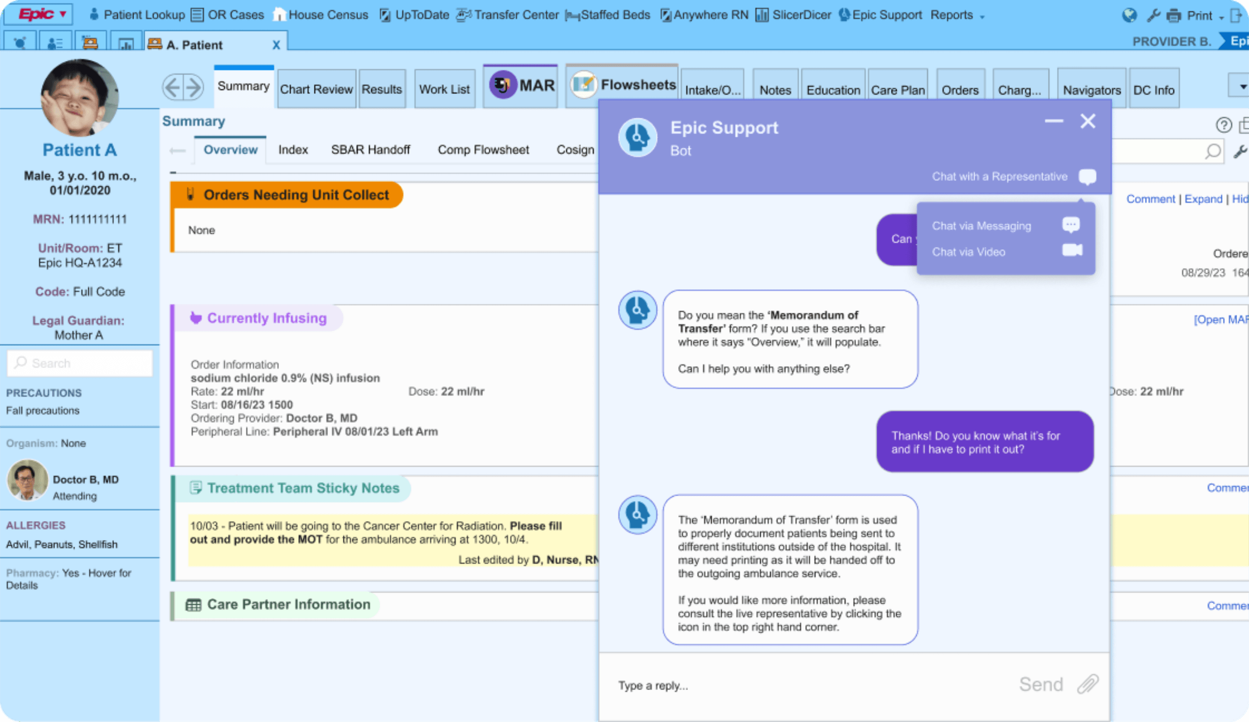
Addition of the Option to Chat with a Live Representative
To both further protect patient privacy and increase user flexibility and efficiency, a simpler form of communication was added.
The option for all forms of communication will populate in a menu option once the “Chat with a Representative” icon is clicked.
Clicking this icon opens the options menu.
Chat window to include multiple sizes
To further allow for user mobility and customization, the chat window can either be large for accessibility or smaller to increase user mobility on the page.
The original option was to minimize the window and turn it into a tab to access the contents behind it, but having more options will lead to better user outcomes and satisfaction.
Clicking this shrink icon will incite the action of making the chat window smaller.
Results & Looking Forward
What’s next for this AI support feature?
The Solution
Implement an AI support tool to aid users in navigating Epic's extensive patient data, enabling healthcare workers to optimize workflow and enhance patient care.
Accessible AI Chatbot Feature
Patient Verification at activation promotes HIPAA (Health Insurance Portability and Accountability Act) ethics and prevents patient errors
UI follows suit with conventional chat windows to minimize user learning curves
Ability to minimize or maximize interface to fit user needs
Escalate to a Live Representative
Adds extra user support to give viability to product help options
Able to speak via video and text to fit hospital and HIPAA policies
Key Takeaways and Future Iterations
Given more time, I would...
Compile data points consisting of what the support feature is most commonly used for, and create features of the application based on it
Test an audio option format for live representative communication to go along with the intended video and text formats
Create user flows that mesh together this support tool and an onboarding tutorial product
Future iterations would likely benefit from task-specific AI applications


